 I like the minimalist approach to the magazine layout on this magazine, plus the drawing on the front has a very grunge style. The magazine cover only uses two colors grey and white, its quite effective as when people put to many colors on a magazine they can ruin it and make it look tacky.
 The magazine flows very easily as there are no elements on the front that clash with each other.
The problem with it is that it doesn't have any hook lines or a masthead, so If I choose this kind of style I would put some in so people would be more attracted to the magazine.
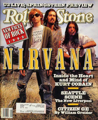
 This is a front cover of a rolling Stone magazine, I like how they have made the main picture there background for the whole front cover. The big strap line of nirvana on the front, its really bold and highlights what the magazine is about, but the way the band members heads cover the magazine title I don’t like as much, I want my magazine title to be easily read and blocked by something else.
 I choose to do some research on this magazine cover because I liked the titles font design, It really works well with the magazines genre, in this case its grunge, I can tell its grunge because the title of the magazine is called 'Grunge'. The whole magazine layout works quite well, though I don't like main picture because it doesn't really give a strong portrayal of grunge. Though the clothes that he is wearing are quite grunge because they are all quite tatty and he has a expression like he doesn't care, and that is quite a prominent look in grunge.
 This is a front cover from Q magazine, I've chosen this cover because it has a special on Grunge, also on the front cover it has a large picture of Kurt Cobain. Also round the picture like a frame the magazine has many pictures of work by grunge artists our things that influeneced them, I like this because it gives a strong sense of the magazine being a grunge magazine.

Good start here Rhys but more detail needed. Use the Magazine terminology checklist to help focus your comments.
ReplyDelete