This is a front cover of the magazine ‘Karrang’ it mainly has Indie/ rock groups in the magazine, they tend to just sick to that genre, and not really include and others.
The set out for the magazine has one large picture of the band Biffy Clyro for its background, this is because they are what the main article is about, having the picture being the main focus point makes it very easy to identify what the magazine will contain.
Under the main picture, which is also, the main layer they have a sub title that reads “Were not doing this to please people, Biffy Clyro, Rocks next super stars’ this is a way of letting readers know who the band are, and the little quote before gives people an idea about the bands ideology.
The actual masthead / title of the magazine has a font that looks like a smashed window; this tells that the magazine has a kind of punk rebel feel to it.
The magazine has many little side advertising to draw the reader in, like there is a small side post that refers back to the main feature of the magazine at tells about 4 free tracks that anyone could download, it gives the reader an incentive to pick up and read the magazine, if someone had a choice between two equally as good magazine what would tip the favour in one way would be if either magazine offered any free items like posters or cd’s.
There is also a very thin masthead at the top, which advertises what some of the magazines features are; it then goes on to say that there are also over 40 reviews inside the magazine.
The magazine cover has three main colours red, white and black, these all seem to be very compatible, they don’t clash but there also not very bright or happy, this is because the target market of the magazine are not really attracted to brighter colours. They have tried to keep all of the text and pictures all the same kind of colours so the cover flows better. They have a grey background in behind the picture of the band, this is so it doesn’t draw any attention away from the picture, and also it doesn’t add another colour to the magazines three-colour rule. The bands clothing and appearance very much sums up the magazines content and the style that the genre has, you can see that all the members of Biffy Clyro have beards and long hair, a very archetypal style for rock bands, and also the main singer has tattoos and play live mainly with his shirt off. The picture itself shows all the band members faces very clearly, this is to make sure that people can recognise them the next time round, also the lead singer and guitarist is standing in the front, this tells me that he is the leader and the other two play back up instruments.

This is the front cover of a Q magazine; it features quite a simple format with around about 6 layers on, though the layout is quite simple it works very well, as the main gaze of the reader would be off the main picture where it depicts Kings of Leon jumping through a large pane of glass, though the picture doesn’t really follow the main rules of a band picture, the drummer is actually the one in the middle and the lead singer is to the left of him. But you can still see each band members faces well enough to recognise them. The language is quite informal as it just has a couple of sentences of punchy dialogue to raise the reader’s curiosity. The language suits the target market, though its very short simple sentences the reader wants to see a big picture of the band, unlike the Kerrang magazine which has lots of text on it they don’t have a as interesting cover picture, because Q are also known for there very long and in depth interviews they don’t really need to include much information on the front of the magazine, also to keep all the sub headings the same they have used the same font for everything and just have highlighted certain parts of the sentence to show the main point, so if you were wondering by would could see the main parts straight away.
The colours that have been used on the cover are Red, black and white, Q use red and white all the time because it’s the same colour as there logo and they want to keep the colour scheme flowing in the magazine. The colour scheme gives a very sombre feel to the magazine, it has exciting content in it to because of the picture if the glass breaking, but the magazine appeals to people who would do a bit more reading instead of just looking at pictures.

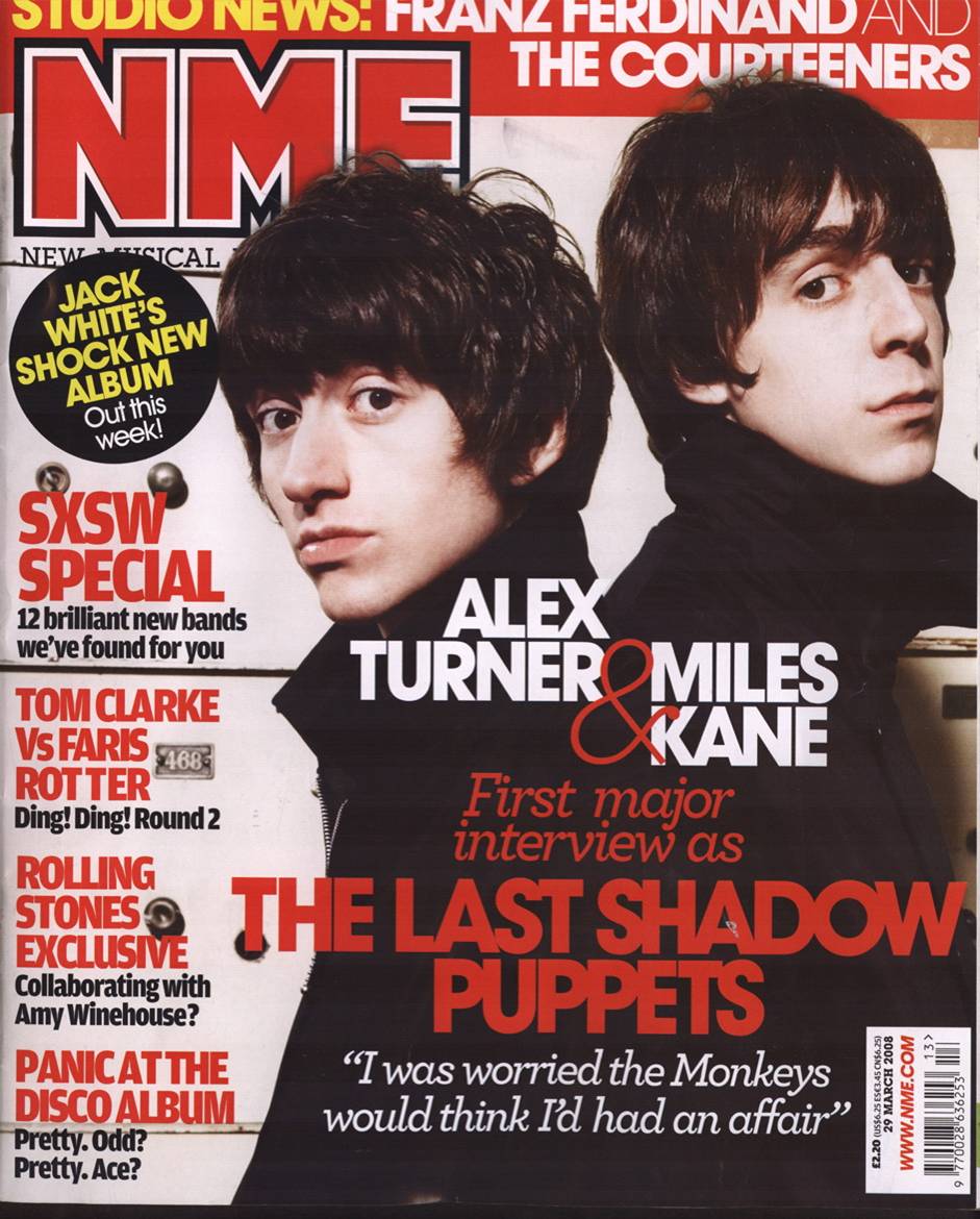
This is a front cover of an issue of NME it has quite a complicated layout with many layers to it. The front cover has a very classic layout; it has all of the pictures to one side and all of the sub heading and mastheads to the left.
This issue has its main article about the last of the shadow puppets; the main picture that features Alex turner and miles Kane is also the background of the cover, though the picture of Alex is more important as it is in front of the writing. The cover has about 7 different layers
The way the writing on the picture has been layed out is that it goes across both of the artists, but the names don’t cross on to the other individual this is because it tells us the name of each of the artists, and it doesn’t overlap to cause confusion.
The language used in on the cover is quite informal, it also uses questions in the sub titles to peak the reader’s interest, and like ‘collaborating with lady gaga’ this makes the reader want to buy the magazine because they want to know the end to the question.
The main three colours used in this magazine are red, black and white, this colour scheme works quite well because as well as having two very common colours that can be used very easily they have also gone for a quite bright red that attracts peoples attention. Also the magazine title ‘NME’ normally has these three colours anyway so they have tried to fit the rest of the magazine around it, making the whole cover flow better and not look tacky.

This is the contents page of Drummer; it features mainly drumming in the magazine hence the title. It has a fairly standard layout, an L shape pictures on one side and sub titles going across and down one side of it, this works quite well because it breaks up the text and makes it more readable. This contents page does have quite a lot of text on it, but if you look quite closely you can see that it actually doesn’t have that much contents its just made it look bigger by having a small amount of text underneath it explaining the feature. The page features 6 pictures with the main article picture in the middle, its also the largest, this is to make it clear what the main part of the magazine will be about.
The pictures don’t have any text to explain what they are about but in the top left hand corner of all the pictures it has a number that refers to what page it is linking to.
Also below the normal list of contents it has a bright red box that say’s Regulars with a golden plus, this makes it look like the magazine is giving all of the contents and a little extra trying to make it look like your getting more for your money, this would convince someone to get the magazine if they thought they were getting a better deal.
The language used in the contents page is quite formal, the sub heading gives you the jist of the article and then it goes on in a little bit more detail about it in full sentences that flow better. There is quite a lot of writing for the contents but they seem to break it up with the use of more pictures than is necessary, this makes the reader want to read them because it seems less daunting then just a block of text.
The colours used in this magazine are red, black and white, this seems to be quite a popular colour scheme as NME have also used it.

This is a contents page for an issue of NME; it has quite a complicated layout with many pictures and quite a lot of text. This contents page has all its sub headings running down the left hand side of the page, this differs from the conventional text on the left and pictures on the right. The images are layed out in a kind of picture book form, all the smaller pictures fit around the bigger main article picture on ‘the Bronx’, they layout has quite a rigid structure, all the pictures and text line up in squares or oblongs this gives the magazine a more formal look. As well as having the main contents on the right hand side they also have many pictures of different artists and then underneath them saying on what page do they feature and what the article is about. The text still travels across the page as a L shape much like many other contents pages I have looked at, it makes the page look more interesting and makes reading the contents page more enjoyable because there are pictures to look at as well.
The language used on the contents page is quite informal, as the contents just lists artists and the more detailed picture text just has a small quote from an artist or a witty quote from the writer. The language used in the magazine appeals to a wider audience as many NME readers wouldn’t want to read that mush to find out what is in an article as opposed to a Q reader who likes to read in depth articles.
The colours used in the contents page are yellow black and white, the monochrome seems to be a standard colour scheme for many magazines, but also the magazine has picked one brighter colour to highlight certain parts of the page, like the title and all the contents pages sub titles.

This is a contents page from an issue of Q magazine, it follows the standards off having text on the left and pictures on the right, it also follows the L rule by having the text go to the side and underneath the main picture.
The layout is very clean and formal; it makes it very easy to look at what is going on in the page. Each time a new section of the page starts they have a colour backed trip and a title, this tells you that one part of the contents and the other part tells you what is featured every month in Q and also what Q is reviewing this month.
The language used on the magazine is very formal, underneath each of the contents sub titles Q goes into a little detail about what the article is about, it gives a little preview of what is inside the magazine. The contents page has only two pictures in, one is a very large picture if the magazines main article on The Courteeners, but there is also a smaller picture by the Q review section of the page, it displays one of the more well known artists so people will think that q has some very good interesting articles with famous artists in.
The colours used on the Page are Q’s typical black, read and white, also the use of black is very wise because it is a very common colour, like for example all the member of the Couteeners are wearing black so Q can use that to there advantage and fit it In to the colour scheme. It’s a very common combination of colours that seems to work really well and makes the magazine look really modern and appeals to the target market.

This is a two page spread of My Chemical Romance featured in a Kerrang magazine. The layout for the spread is quite organised as all the text is on the second page and it’s organised into blocks. The overall layout is quite formal because it’s all dived into square blocks, because on the left hand size page they have a large picture of the lead singer of the and then the picture continues onto the right hand side of the page, it suggests that the man with the micro phone is the most important person in the band, also 2 of the rest of the pictures have him in to. The title is set out diagonally slanted across the page, it suggests that the band does have some structure to it but it portrays itself to the media as a grungy rock band that don’t always follow the rules. As well as having the main article the 2 page spread has a little strip running down the right hand side of the page, the mini article gives an overview of some of their new tracks, this gives the reader a little overview of their music as well as an article about the band.
The language used in this article is quite formal and includes quite a lot of quotes from the band, this format of article, as Q have a question and answer session with the band that records the exact conversation between the band and the interviewer, Karrang have gone for a different format where they have a lot of quotes from the band but we don’t get any of the interviewers dialogue.


 I choose to do some research on this magazine cover because I liked the titles font design, It really works well with the magazines genre, in this case its grunge, I can tell its grunge because the title of the magazine is called 'Grunge'. The whole magazine layout works quite well, though I don't like main picture because it doesn't really give a strong portrayal of grunge. Though the clothes that he is wearing are quite grunge because they are all quite tatty and he has a expression like he doesn't care, and that is quite a prominent look in grunge.
 This is a front cover from Q magazine, I've chosen this cover because it has a special on Grunge, also on the front cover it has a large picture of Kurt Cobain. Also round the picture like a frame the magazine has many pictures of work by grunge artists our things that influeneced them, I like this because it gives a strong sense of the magazine being a grunge magazine.


