Monday, 20 December 2010

Genre of music my magazine will be about.

The genre of music that I have chosen for my magazine is grunge/ rock.


Grunge (sometimes referred to as the Seattle sound) is a sub genre of alternative rock that emerged during the mid-1980s in the American state of Washington, particularly in the Seattle area. Inspired by hardcore punk, heavy metal, and indie rock, grunge is generally characterized by heavily distorted electric guitars, contrasting song dynamics, and apathetic or angst-filled lyrics. The grunge aesthetic is stripped-down compared to other forms of rock music, and many grunge musicians were noted for their unkempt appearances and rejection of theatrics. Grunge music really tried to get away from the mainstream corporate take on music and make a new sound that gave a very who cares attitude out to the media.


Here is a list of some Seattle based grunge bands

[edit]Seattle area

  • 7 Year Bitch
  • Alice in Chains
  • Blood Circus
  • Green River
  • Gruntruck
  • Hammerbox
  • Love Battery
  • Mad Season
  • Malfunkshun
  • Melvins
  • Mono Men
  • Mother Love Bone
  • Mudhoney
  • My Sister's Machine
  • Nirvana
  • Pearl Jam
  • Screaming Trees
  • Skin Yard
  • Soundgarden
  • Tad
  • Temple of the Dog
  • Truly
  • The U-Men


Audience Profile.

The Audience for my magazine would likely read other music magazines like Q, Kerrang and NME. As my audience would like the bands that would fall into the category Grunge/Rock, so my audience would have to like bands such as 'Nirvana' and 'Biffy Clyro'. The audience that would read my magazine would like a mix of articles and pictures, also interviews and stuff like the top 50 songs this month, though my audience would have to like a fairly quirky kind of magazine.
My Audience would ideally have some type of income, whether it would be minimum wage to a larger wage,  there leisure activities should realistically be listening to music often, going to concerts fairly regularly and maybe playing an instrument of some kind e.g. electric guitar or drums. I would probably think that they would either buy a music magazine every other month or have a subscription to a magazine, because this would show me that they do take the time to sit down and read a magazine every so often.
Also I would rely on some of the audience to pass information on to there peers about my magazine so I could promote even more sales.

Analysis of institution that would publish my Magazine.

IPC Media produces over 60 iconic media brands, with print alone reaching almost two thirds of UK women and 42% of UK men – almost 26 million UK adults – while our websites collectively reach over 14 million users every month.
IPC's diverse print and digital portfolio offers something for everyone, with a focus on three core audiences: men, mass market women and upmarket women.
Our men's portfolio (IPC Inspire) comprises a wealth of leisure brands including Country Life, Horse & Hound,Rugby World and Decanter, as well as lifestyle brands including Nuts, Mousebreaker and NME.
As well as reaching two thirds of uk women and uk men IPC media also has experience when it comes to publishing music magazines as it publishes NME and uncut.


Decide on magazine titles

As I am doing a magazine on grunge/rock music I need a title that is quite aggressive and sounds quite ruff, to reflect the music style.


Here are some idea's for magazine names


  • Skarring- I thought this sounded quite grungy, but I also purposely spelt scaring wrong to make it look more aggressive with the K instead of the C.
  • Rift- I thought this one sounded quite good because you could also see it as Grunge setting itself away from mainstream rock, hence there being a rift.
  • Rampant-This title works quite well because the word rampant sounds quite aggressive and also means unrestrained and violent, which describes grunge music quite well.
  • Collision- I thought that Collision works quite well, because you could describe grunge music as being a collision of  hardcore punk, heavy metal, and indie rock.


I have decided on Rift because I think that it sounds quite grungy, Its not to long so it gies me more room to play with when I create my magazine, it looks really good in the font and I think in this case less is more.


Magazine research

I like the minimalist approach to the magazine layout on this magazine, plus the drawing on the front has a very grunge style. The magazine cover only uses two colors grey and white, its quite effective as when people put to many colors on a magazine they can ruin it and make it look tacky. 
The magazine flows very easily as there are no elements on the front that clash with each other.
The problem with it is that it doesn't have any hook lines or a masthead, so If I choose this kind of style I would put some in so people would be more attracted to the magazine.

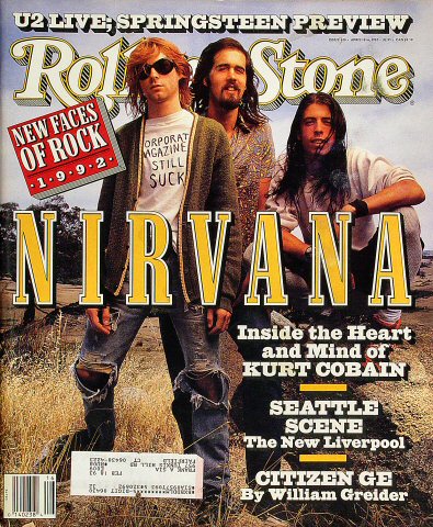
This is a front cover of a rolling Stone magazine, I like how they have made the main picture there background for the whole front cover. The big strap line of nirvana on the front, its really bold and highlights what the magazine is about, but the way the band members heads cover the magazine title I don’t like as much, I want my magazine title to be easily read and blocked by something else.

I choose to do some research on this magazine cover because I liked the titles font design, It really works well with the magazines genre, in this case its grunge, I can tell its grunge because the title of the magazine is called 'Grunge'. The whole magazine layout works quite well, though I don't like main picture because it doesn't really give a strong portrayal of grunge. Though the clothes that he is wearing are quite grunge because they are all quite tatty and he has a expression like he doesn't care, and that is quite a prominent look in grunge.

This is a front cover from Q magazine, I've chosen this cover because it has a special on Grunge, also on the front cover it has a large picture of Kurt Cobain. Also round the picture like a frame the magazine has many pictures of work by grunge artists our things that influeneced them, I like this because it gives a strong sense of the magazine being a grunge magazine.

Saturday, 18 December 2010

Up dated Mood Board


Analysis of Colour palettes , fonts


Colors opposite to each other in a color scheme work together. The further you get into the circle the darker the colors until they become black. So vice versa the further out go the circle you get the lighter the color is.


Color Wheel


The colors that have been used in this NME magazine are Red, White and black; these colors work together because white and black are both Monochrome. Red and black have always worked well together, that’s why there are many designs in the media today with that certain color scheme in. The colors red and black suggest danger normally, like Dennis the menace always wore a red and black jumper like the one below, and Kurt cobain always used to famously wear a jumper like it to. It could also be depicted as quite an aggressive color scheme as Kurt Cobain was the lead singer and guitarist of Nirvana a Grunge band. Also in the film ‘The Nightmare On Elm Street’ the killer freddy Kruger wears a black and red jumper similar to Kurks, the red and black combination can be associated with many things, but in the magazine it uses the scheme to draw peoples attention, but it also tells me that the music in the magazine would be more aggressive than the everyday pop music. 


I have decided that for the font of my Titles and strap lines I need quite a rough and grungy title so I used the site www.cooltext.com to find some that would suit my magazine.


I quite like this one as it does look like a grunge title but it might be a bit to grungy and makes it quite hard to read on a coloured background.


I quite like this font, it looks really smudged and really gives the idea that the magazine is about grunge music. I like the effect of some of the letters being bigger than the others it gives a very unstructured title, and this links in with how unstructured grunge music was.


I quite like the bold letters that are textured on this font, the random use of accents also makes the font quite interesting, though this font is a bit to relaxed for my liking.


I really like this font, it really reflects what I was trying to go for with my magazine, though its a bit hard to read.


This font reminds me of a spray paint stencil, though Its quite a good looking font its actually quite hard to read because the spacing between some of the letters is quite far apart.